How to Build a Website from Scratch
A manual for creating a website that engages users and transforms them into customers.
This guide outlines essential aspects of effective website design, the importance of clear goals, user personas, mobile-first design, accessibility, and a concise content structure. I show you how to use templates and themes for efficiency and aligning design with user expectations.
When discussing design, most people immediately think of colors, appealing fonts, or the layout of a website. However, web design encompasses much more than that!
This is what great web design is supposed to achieve:
The primary objective of every website is to solve a problem for its users.
The primary goal for every business owner is to convert website visitors into paying customers.
How can your business website assist visitors and provide an exceptional user experience? To achieve this, we'll adopt a holistic approach to web design, walking trough all facets of an exceptional website.
When visitors browse your site, they typically have several questions in mind:
Website users often return to a site multiple times before making an online purchase. The initial visit is usually for information gathering ("What is this?"), while subsequent visits are transactional, involving actions like scheduling an appointment or making a purchase.
Defining the primary goals of your website gives it a clear purpose and makes it easier to deliver the right information. You need a "north star" that you can refer to whenever you or someone else works on the website, ensuring that you stay on the right path. This helps eliminate distracting elements and keeps the focus on your business objectives.
A persona represents a typical client of your business, while a use case outlines their problem and the steps required to solve it source.
A persona in User Experience (UX) design is a fictional representation of a target user based on research and data. It defines key characteristics, behaviors, and needs of a specific user group. Personas are used to humanize and empathize with users. Create and reference them throughout building your website, ensuring that design decisions align with user preferences, needs, and pain points, and to understand their mindsets when navigating your site.
An easy tool to generate personas is www.userpersona.dev.

An extensive team page may be of no help if the user struggles to find contact information. In our use case, what a user wants is an easy way to get in touch. In this case, directing the user to a phone number makes more sense than displaying a business organization chart. However, a team page can still serve other use cases, such as building trust. What communication means does the user prefer? A younger person in an informal setting might prefer WhatsApp while email and landline phone numbers are more appropriate in a business context.
Users don't visit a website to admire its aesthetics; they seek quick solutions to their problems. They don't care about features that don't contribute to their goals. The more clutter and friction you introduce, the higher the chance they'll leave your site. The key principle is: Don't Make Users Think! source
Users have a concept of how a website is supposed to work, based on other websites that offer the same services. When designing your website, repeat what is working for others. Too much creativity can actually harm your conversion goals.

A good test is to go trough every element on your website and to ask yourself: Does the website still offer the same value if I remove this element (button, image, link etc)? If the answer is yes, then you might remove the element as it unnecessarily adds clutter to the website structure.
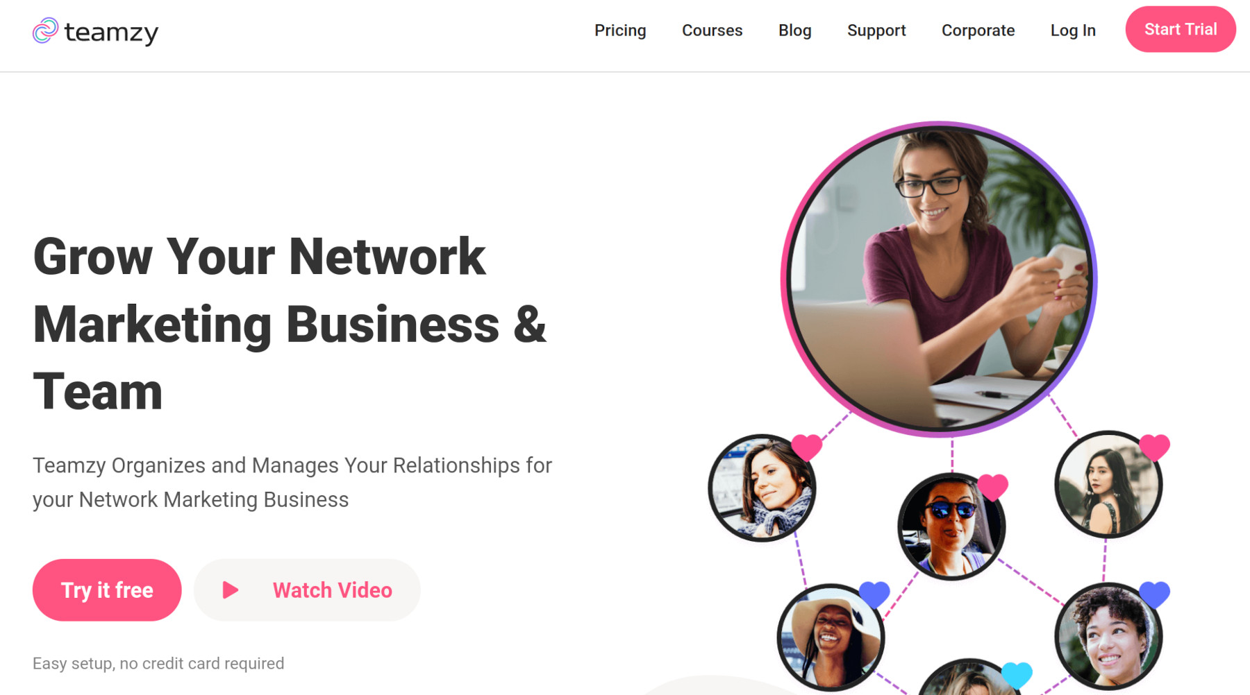
www.flyhyer.com is an example of a website with an excellent information architecture. As a user I don't have to think what this website does but understand everything at a glance. All elements on this page have a clear function, there is no bluff. Note the call to actions for the most important use cases on the bottom right.

Your website's structure should be reflected in the URL paths, following a meaningful hierarchy. A URL path is what comes after the domain bit of the URL: domain.com/this/is/the/path. Well-structured URLs are easier for humans and search engines to understand.
Example of a good URL structure: /men/sneakers. Easy to understand what the product is, right?
Mobile design, also known as responsive design, ensures your website works seamlessly on smartphones, such as iPhones and Android devices. Nearly 60% of all website visits come from smartphones source. Mobile screens are smaller, requiring efficient use of space, and user needs may differ when browsing on mobile devices.
I recommend to start the design process with mobile design first approach. Mobile solutions are often adaptable to larger screens, while the reverse can be challenging. Mobile is now the norm for internet usage, so optimizing your website for smartphones is essential.
Users are accustomed to specific website layouts, like the familiar burger-like menu on mobile devices, a Pricing page or Call-To-Actions. Breaking these patterns can confuse users. Remember that users visit your site to find solutions to their problems. Aligning your website with their expectations increases the likelihood of conversion.
Your brand design should be unique, your website design doesn't need to reinvent the wheel
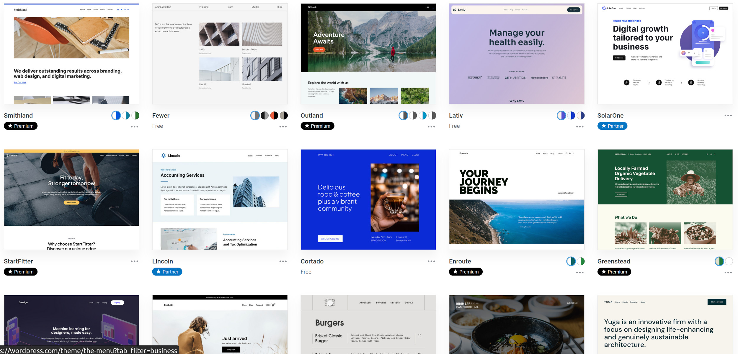
Website builders like Squarespace and Content Management Systems like Wordpress offer a variety of predefined designs, so-called themes. These themes adhere to common layouts and most adapt to mobile screens.

Using themes can also save on web development costs. Compile a list of 2-3 websites you like before consulting with web designers. You can even refer to themes as a starting point for discussions with designers.
Web accessibility ensures that websites, tools, and technologies are designed for use by people with disabilities source. Approximately one-quarter of the world's population has some form of visual impairment source. To create an accessible website:
Remember, the primary purpose of your website is to solve users' problems, so focus on readability and accessibility. Remove distracting elements and keep it simple!
Allocate sufficient space for text to effectively convey your business's message. Search engines like Google rely on text to determine your website's relevance in search rankings. Combining text and images is vital, as text is an important ranking factor. Your content should be clear, concise, and informative for both users and search engines. I think it is very hard to rank successfully in Google's search result without at least some paragraphs of text content on each page.
The same way your website overall needs to have a clear structure, the same applies to text as well:
A manual for creating a website that engages users and transforms them into customers.
Find the best Shared, VPS and Managed WordPress hoster for your small business website. A community based review for all technical levels.
Tips for memorable names, steps to buy and register a domain and pitfalls to avoid.
Top website builders for small businesses and e-commerce. A honest review of Square, Squarespace, Wix, Shopify, Webflow, and BigCommerce based on community feedback.
Is WordPress the right choice for your website? I discuss the tradeoffs, alternatives and hosting options.
Optimize your small business website with the following free SEO tools and tips.
All you need to know to outsource your website to a web designer or developer.